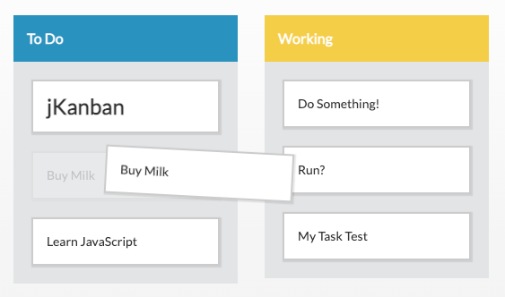
See the Pen jKanban Example 1 by bunatree (@bunatree) on CodePen.
<head>...</head> で指定します。下記の「path/
<link rel="stylesheet" href="path/to/jkanban.min.css">
<script src="path/to/jkanban.min.js"></script>
<link rel="stylesheet" href="https://cdn.jsdelivr.net/npm/jkanban@1.3.1/dist/jkanban.min.css">
<script src="https://cdn.jsdelivr.net/npm/jkanban@1.3.1/dist/jkanban.min.js"></script>
<body>...</body> 内に <div id="kanban-canvas">...</div> を配置しています。これがカンバンが表示される場所になります。
<!DOCTYPE html>
<html lang="ja">
<head>
  <meta charset="UTF-8">
  <meta http-equiv="X-UA-Compatible" content="IE=edge">
  <meta name="viewport" content="width=device-width, initial-scale=1.0">
  <title>jKanban サンプル (1)</title>
  <!-- jKanban の .css ファイルを読み込む -->
  <link rel="stylesheet" href="https://cdn.jsdelivr.net/npm/jkanban@1.3.1/dist/jkanban.min.css">
  <!-- jKanban の .js ファイルを読み込む -->
  <script src="https://cdn.jsdelivr.net/npm/jkanban@1.3.1/dist/jkanban.min.js"></script>
</head>
<body>
  <div id="kanban-canvas">
    <!-- ここにカンバンが表示される -->
  </div>
  <script>

    // カンバンに表示されるカラムやカードを定義
    var dataContent = [
      {
        "id"    : "column-id-1",
        "title" : "カラム (1)",
        "item"  : [
          {
            "id"      : "item-id-1",
            "title"   : "カード 1"
          },
          {
            "id"      : "item-id-2",
            "title"   : "カード 2"
          }
        ]
      },
      {
        "id": "column-id-2",
        "title": "カラム (2)",
        "item": [
          {
            "id": "item-id-3",
            "title": "カード 3"
          }
        ]
      },
      {
        "id": "column-id-3",
        "title": "カラム (3)",
        "item": [
          {
            "id": "item-id-4",
            "title": "カード 4"
          },
          {
            "id": "item-id-5",
            "title": "カード 5"
          }
        ]
      }
    ];

    // ここで jKanban を実行する
    var kanban = new jKanban({
      element: '#kanban-canvas',  // カンバンを表示する場所のID
      boards: dataContent,        // カンバンに表示されるカラムやカードのデータ
      gutter: '16px',             // カンバンの余白
      widthBoard: '250px',        // カラムの幅 (responsivePercentageの「true」設定により無視される)
      responsivePercentage: true, // trueを選択時はカラム幅は%で指定され、gutterとwidthBoardの設定は不要
      dragItems: true,            // trueを選択時はカードをドラッグ可能
      dragBoards: true            // カラムをドラッグ可能にするかどうか
    });

  </script>
</body>
</html>
var kanban = new jKanban({
  // ここにオプションや表示データを書く
});
element: オプションで指定します。この値に、上記の <div id="kanban-canvas">...</div> で指定された id の「kanban-canvas」を半角シャープ記号を添えて記述します。
element: '#kanban-canvas'
boards: オプションで、JSON 形式のデータとして定義します。id: でカラムの ID を指定、title: でカラムのタイトル(カラム上部に表示される見出し)を指定します。item: には、カラムに表示したいカードを入れ子にして定義します。
[
  {
    "id"    : "column-id-1",
    "title" : "カラム1のタイトル",
    "item"  : [
      { "title": "カード 1" },
      { "title": "カード 2" },
      { "title": "カード 3" }
    ]
  }
]
var dataContent = [
  {
    "id"    : "column-id-1",
    "title" : "カラム (1)",
    "item"  : [
      {
        "id"      : "item-id-1",
        "title"   : "カード 1"
      },
      {
        "id"      : "item-id-2",
        "title"   : "カード 2"
      }
    ]
  },
  {
    "id": "column-id-2",
    "title": "カラム (2)",
    "item": [
      {
        "id": "item-id-3",
        "title": "カード 3"
      }
    ]
  },
  {
    "id": "column-id-3",
    "title": "カラム (3)",
    "item": [
      {
        "id": "item-id-4",
        "title": "カード 4"
      },
      {
        "id": "item-id-5",
        "title": "カード 5"
      }
    ]
  }
];
dataContent を boards: オプションの値として指定します。
var kanban = new jKanban({
  element: '#kanban-canvas',
  boards: dataContent
});
var kanban = new jKanban({
  element: '#kanban-canvas',  // カンバンを表示する場所のID
  boards: dataContent,        // カンバンに表示されるカラムやカードのデータ
  gutter: '16px',             // カンバンの余白
  widthBoard: '250px',        // カラムの幅 (responsivePercentageの「true」設定により無視される)
  responsivePercentage: true, // trueを選択時はカラム幅は%で指定され、gutterとwidthBoardの設定は不要
  dragItems: true,            // trueを選択時はカードをドラッグ可能
  dragBoards: true            // カラムをドラッグ可能にするかどうか
});
dragEl や dropEl などのコールバックが用意されていますが、この「El」はカードのことを表しています。コールバックの使い方については第3回のブログ記事で紹介します。<div> で、子要素として <header> と <main> があります。前者にはカラムのタイトルが、後者にはカードが表示されます。kanban-canvas.png
jkanban_eyecatch.png